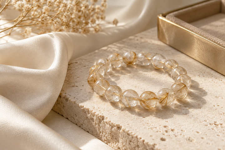
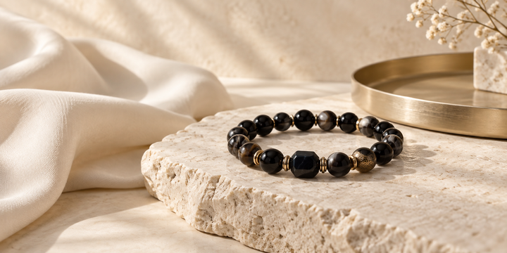
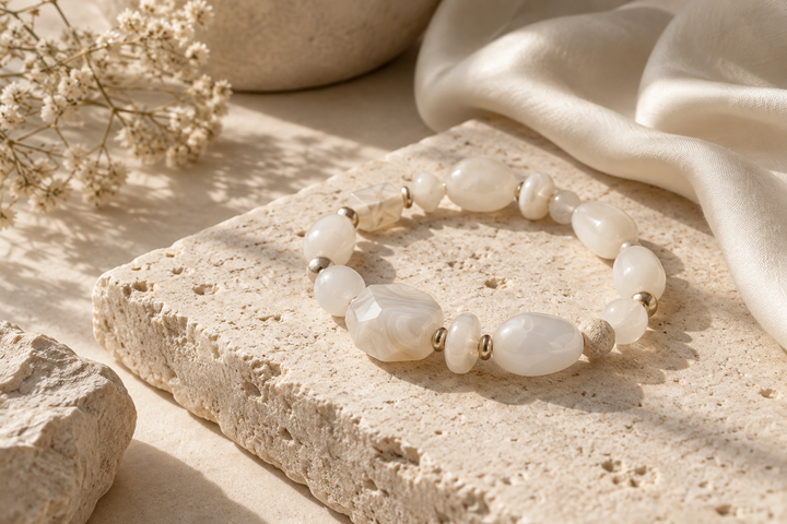
If you are weighing a gold vs silver crystal bracelet, begin with the whole design rather than a rule about which metal you “should” wear. Warm gold-tone details can soften a palette of blush, amber, and cream; silver-tone details can give pale or transparent-looking stones a cooler edge. Neither finish is inherently more elegant. The better choice is the one that works with your clothes, the jewelry you already reach for, and the role you want the bracelet to play.
There is also a difference between metal tone and metal material. Gold-tone and silver-tone describe appearance. A product listing should tell you what the actual accents are made from. Keep both questions in view as you compare bracelets.
Start With the Overall Look
Look at a bracelet from arm’s length before studying a single bead or accent. Which color do you notice first? Does the metal quietly frame the stones, or does it become a visible design feature? A restrained silver-toned detail can feel bright beside white and clear beads. A small gold-toned detail can add warmth to a mixed palette without turning the entire piece into a statement.
What Gold-Tone Accents Bring to a Crystal Bracelet
Gold-tone accents tend to read warm. They can pick up the gentle yellow of citrine, the blush in a patterned stone, or the creamy cast of an ivory blouse. That warmth can be subtle: it may appear only where a small accent catches the light.
The Aurelia Golden Balance Bracelet offers a concrete example. Its current product listing identifies Cherry Blossom Agate, Citrine, and 18K Gold-Plated Copper Accents. The blush and golden-yellow stones sit beside a warm metal finish. This is a bracelet with gold-plated copper details, not a solid-gold bracelet. The Aurelia Collection is a useful place to compare how other warm palettes carry a similar visual mood.
What Silver-Tone Accents Bring to a Crystal Bracelet
Silver-tone details often create a cooler, cleaner impression. They can sit quietly with clear, white, softly green, gray, or blue-leaning palettes. Against transparent-looking stones, a silver-toned accent may feel especially light because it does not add the same warm contrast as gold tone.
The Lunelle Moonlit Mist Bracelet currently lists Clear Quartz, Tianshan Cui Quartzite, and Silver-Plated Accents. Its clear and soft-green palette gives the silver-colored details a cool visual setting. The listing does not identify the base metal beneath the silver plating, so it would be inaccurate to call those accents sterling or 925 silver. For more light, cool-toned designs, browse the Lunelle Collection.
Let the Crystal Colors Share the Decision
Metal tone is only one part of the palette. A gold-toned accent beside warm yellow or pink stones reinforces their warmth. A silver-toned detail beside clear or pale stones can make the whole design feel cooler. Neither pairing is mandatory. Contrast can be attractive when it has room to breathe.
Compare the complete bracelet in photographs that show the whole piece. A close-up of a single accent can exaggerate its importance; a full view shows how often that metal color appears. If the stones already have several colors and patterns, a quiet finish may be enough.
Natural stones also vary in shade, clarity, and pattern. A bracelet’s overall color direction should remain recognizable, but individual beads need not match a photograph exactly. Choose a palette you like as a whole rather than relying on the shade of one pictured bead.
Consider the Wardrobe You Actually Wear
Open your closet in your mind. Do cream, beige, camel, warm brown, and muted pink appear often? Gold-tone accents may feel familiar with those colors. If white, charcoal, cool blue, gray, and black form most of your wardrobe, a silver-tone direction may be an easy starting point. These are visual possibilities, not rules. A deliberate contrast often gives a simple outfit its most interesting detail.
Coordinate With Watches and Existing Jewelry
Your watch, rings, earrings, and everyday necklace offer a better reference than a universal color chart. If most of those pieces have gold-toned details, a warm bracelet can repeat the finish and make the look feel continuous. If your jewelry is predominantly silver-toned, a cool bracelet may blend in effortlessly.
A watch deserves special attention because it occupies the same visual space as a bracelet. Consider its case, strap hardware, and dial—not just the color of its band. If you plan to wear both on one wrist, check their scale and how they move together. For placement and contact considerations, see our guide to wearing crystal bracelets with a watch. There is no need to buy a bracelet in the watch’s exact finish; a repeated color elsewhere in the outfit can make a contrast look deliberate.
Can You Mix Gold and Silver Tones?
Yes. Mixed metals can feel collected and personal when the combination has a little structure. Try repeating one tone in two places: a gold-toned bracelet accent and a small gold earring, for example, while a silver-toned watch remains the stronger piece. Or let a mixed-metal watch connect jewelry in both finishes.
Keep the number of competing focal points in check. If a bracelet has patterned stones, prominent accents, and a bright metal finish, nearby pieces can be quieter. You do not have to match every clasp or bag buckle. You only need the full look to feel considered to you. If you enjoy wearing more than one bracelet, the crystal bracelet stacking guide explores how to balance several pieces without crowding the wrist.
Skin Tone Is an Option, Not an Instruction
Skin tone may help you notice whether a warm or cool finish creates the contrast you enjoy. It does not determine what you are allowed to wear. The familiar advice that warm undertones must wear gold and cool undertones must wear silver leaves out personal taste, clothing color, and the stones beside the metal.
If you can, hold a warm-toned and a cool-toned piece near your wrist in ordinary daylight. Look at each with a top you wear often. Which combination makes the bracelet feel like yours? You may prefer both for different outfits. You may even favor the finish that contrasts with your skin rather than the one that blends in.
Compare Two Real Styling Directions
Warm, softly detailed
Picture Aurelia Golden Balance with an ivory shirt, warm neutral trousers, and a small gold-toned earring. Its Cherry Blossom Agate and Citrine provide the color, while its 18K gold-plated copper accents connect the bracelet to the other jewelry. A dark outfit could give the same piece more presence without changing its materials or mood.
Cool, light, and restrained
Now picture Lunelle Moonlit Mist beside a white cuff, soft-gray knit, or pale blue shirt. Clear Quartz and Tianshan Cui Quartzite create a light palette, with silver-plated accents carrying the cooler detail. A simple silver-toned watch could continue that direction; a warm watch could introduce a deliberate contrast. These examples describe styling, not a claim that either bracelet has been tested beside a particular watch or outfit.
How to Choose When You Like Both
First, decide what you want the bracelet to do visually. Should it disappear into your everyday jewelry, add one quiet contrast, or become the warmer or cooler focal point? Then compare the full materials descriptions. “Gold tone” and “silver tone” tell you how a finish looks; they do not tell you whether a component is solid metal, plated, or made with an unspecified base. The U.S. Federal Trade Commission’s jewelry buying guidance distinguishes gold plating and silver plating from solid gold and sterling silver. Read the product’s own wording rather than filling in a metal from its color.
Finally, consider fit and care. A bracelet you like visually still needs to suit your wrist and routine. Our broader crystal bracelet buying guide covers materials, sizing, natural variation, and day-to-day practicality. Here, make the metal-tone decision by choosing the full palette you are most likely to wear.
Frequently Asked Questions
Should I choose gold-tone or silver-tone crystal jewelry?
Start with the bracelet’s overall palette and the jewelry you already wear. Gold tone can add warmth; silver tone can create a cooler impression. Neither is automatically more refined. Check the listed metal material as well as its color.
Can I mix gold-tone and silver-tone jewelry?
Yes. Repeat one finish in a small second detail, or use a watch or ring to connect the two tones. Keep the overall composition comfortable and avoid adding pieces solely to make every metal match.
Does crystal color matter when choosing the metal tone?
It changes the visual effect. Warm stones can echo gold-toned details, while pale or clear stones can look crisp beside silver-toned ones. Contrasting pairings are also possible; judge the full bracelet rather than one bead.
Should my bracelet match my watch?
It can, but it does not have to. A shared metal tone can look cohesive, while a controlled contrast can add interest. Check the two pieces together on your wrist and notice both their proportions and points of contact.
Does skin tone determine whether gold or silver looks better?
No fixed skin-tone rule can make that choice for you. Skin tone is one optional visual reference alongside clothing, crystal color, existing jewelry, and personal preference.
Can I wear both metal tones in the same outfit?
Yes. Let one tone lead and allow the other to appear as a smaller detail, or balance them through jewelry you already own. The most useful test is whether the combination feels intentional with your actual wardrobe.
Choose the Finish That Feels Like Yours
The gold vs silver crystal bracelet question becomes easier when you look past a metal-color rule. Compare the stones, the exact accent materials, and the clothes and jewelry that will sit beside them. Warm and cool finishes can both be quiet, expressive, or beautifully restrained. Explore the Aurelia and Lunelle pieces above, then choose the complete design you can picture wearing on an ordinary day.